When Colours Answer Each Other
A shade on the face is never judged alone. It is read against the jacket, the scarf, the wall behind you. Styling with colour means deciding what that conversation should sound like.
Colour is relative
The most useful sentence ever written about colour for anyone who gets dressed in the morning comes from a painter, not a stylist. In 1963 Josef Albers published Interaction of Color, a teaching book built on exercises in which the same square of paint appears to change when its surroundings change.
"In visual perception a color is almost never seen as it really is — as it physically is. This fact makes color the most relative medium in art."
— Josef Albers, Interaction of Color (Yale University Press, 1963)
Albers was talking about paper and paint, but the principle travels directly to a face and an outfit. The same terracotta lipstick looks brighter beside a grey sweater and quieter beside a rust coat. Nothing about the lipstick changed; its neighbour did. That is why a shade can feel "wrong" one day and perfect the next, and why testing makeup only in a bathroom mirror, without the clothes, tells half the story.
A century earlier, the French chemist Michel Eugène Chevreul, working on dyes at the Gobelins tapestry manufactory in Paris, described what he called simultaneous contrast: placed side by side, two colours push each other apart, each appearing tinted by the opposite of its neighbour. His 1839 treatise on the harmony and contrast of colours influenced generations of painters. For styling, the takeaway is practical: contrast intensifies, proximity blends.
The echo
An echo repeats something. It need not repeat the exact hue; it may repeat temperature, depth or saturation. A brick-red lip with a camel coat echoes warmth. A plum cheek with an aubergine turtleneck echoes depth. A soft taupe eyeshadow with a stone-coloured linen suit echoes muted saturation.
Warm echoTerracotta lip, camel trench, tan leather bag.
Depth echoPlum stain, charcoal wool trousers, black boots.
Muted echoNude-brown lip, ivory knit, oatmeal scarf.
Echoes feel calm and coherent. They suit days when you want the overall look to register before any single element does. The risk is flatness: if every colour sits at the same depth, nothing anchors the eye. A dark belt, a defined brow or a crisp white collar can lift an echo without breaking it.
The interruption
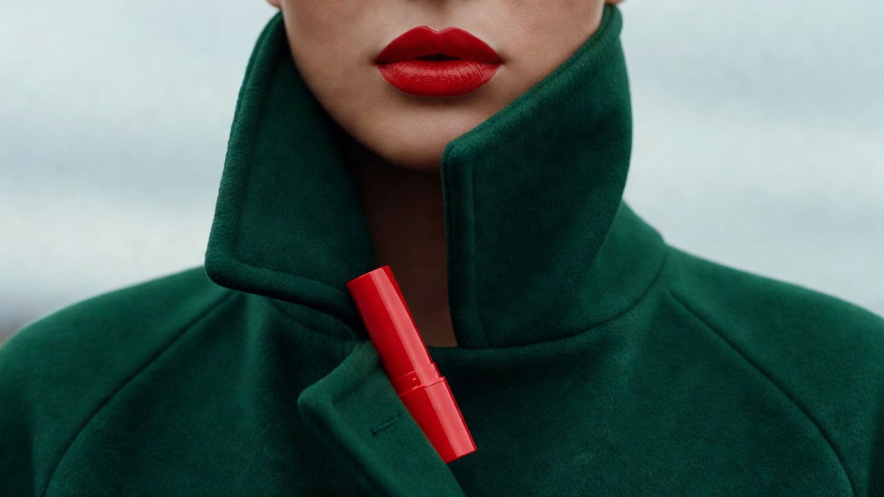
An interruption introduces a colour the outfit does not contain. It is the red lip on an all-black look, the coral cheek against a grey suit, the green liner with a rust dress. Interruptions create energy because they create edges, exactly the effect Chevreul described.
An echo asks the look to be read as a whole. An interruption tells the eye where to begin.
The classic case is red with black. When Revlon launched its "Fire and Ice" lipstick and nail campaign in 1952, the image of a red lip against a silver sequinned gown became a defining picture of mid-century glamour. The lesson there is not that red is required; it is that a single saturated colour against a restrained field reads as a decision.
Near-complementary pairings — red and green, orange and teal-adjacent olive, violet and ochre — interrupt more forcefully. Used at full strength on both face and clothes they can compete. Used with one side muted — a crimson lip with a moss-green knit rather than an emerald one — they feel confident rather than costume-like.
Neutrals are never neutral
Black, white, grey, navy-free charcoals, beige and brown all carry temperature. A cool optic white makes a warm peach blush look warmer; a creamy ecru makes the same blush look softer. Charcoal can read faintly green or faintly violet depending on the dye. Before deciding that a shade "doesn't suit" you, check what the nearest garment is doing to it.
Many people use seasonal colour analysis, popularised in Carole Jackson's 1980 book Color Me Beautiful, to choose shades. It can be a helpful vocabulary. We treat it as one lens among several rather than a verdict: the outfit you are wearing on a given day often matters as much as any category assigned to your complexion.
A small exercise
Take one lipstick you own and hold it beside three garments: one that echoes it, one that interrupts it, one neutral. Look in daylight near a window. Notice which pairing makes the lipstick look most like itself, which makes it louder, which makes it recede. You are not looking for a correct answer. You are learning how your own colours behave in company, which is the whole point of styling with colour.
Next essay: Shine Beside Texture, on how finish shapes the same conversation.